Discovering User Needs
Finding Efficiency through Contextual Inquiry

Overview
Introduction
Effective and efficient work is highly valued by all businesses, but it is even more important when your entire business is built upon time-savings. Dispatch is a courier service that relies on saving time and when helping their customers, Dispatch needs a system that will allow their Customer Success Team (CST) employees to be as efficient as possible.
The Application
I was provided with a demo version of the current application that the CST uses. I was also provided with the recently developed prototype (with limited functionality). This allowed me to understand what areas had already been adjusted from the first version. With these tools, I conducted a cognitive walkthrough to understand their functionality further.
The Challenge
In this setting, our challenge was to identify the current pain points experienced by the CST employees, and discover other improvements in the application that would meet the needs of the users.
The Solution
I proposed additional features for the CST application which included a highly visible note system, an employee-assignment feature (to ensure that high-priority orders are taken care of by a team member) and a search feature to quickly locate available drivers within a specific market.
Methods & Tools
Cognitive Walkthrough | Contextual Inquiry | Usability Testing | Sketch | InVision
Personal Reflection
This project was a personal favorite as I was able to gain empathy for the users very quickly, having worked in customer service roles previously. I especially enjoyed being able to hear their needs, and I was excited to develop recommendations that I knew would help satisfy those needs.
Client & Users
The Client
Dispatch was the client for this project, and whatever recommendations I provided to help the CST would ultimately help Dispatch. By ensuring that the CST employees could be successful in their work, Dispatch customers would have a better experience working with the company, and if customers are satisfied, this will lead to customer retention and potentially conversion of new customers.
The Users
For this project, the main user is part of the CST at Dispatch. This team is comprised of 5 individuals and they provide nationwide customer support. They engage with customers, contacts at pick-up and drop-off locations, and Dispatch leads out in the field. With multiple lines of communication that circulate around orders, one of my first observations was how critical it would be to ensure that information is easily shared among the team.
The Process
Cognitive Walkthrough - Finding What Exists
The results of my cognitive walkthrough were positive overall, but with one exception. An ice cream cone icon in the prototype was difficult to quickly see and use for navigation. I hypothesized that this would be problematic for users, and noted this down to look at during contextual inquiry. Also, I noticed that a positive walkthrough didn’t necessarily translate to optimum efficiency. I noticed that the efficiency of the site could be improved with a better architecture and clear language, and I noted this as a main area to observe when I visited the company.

The results of the cognitive walkthrough
Contextual Inquiry - Understanding the User
The research was done through contextual inquiry at the Dispatch headquarters and involved two 30-minute interview sessions with a CST employee. The first interview session took place at the user’s desk where we discussed the current application that the employees use to facilitate day-to-day business. We asked what types of tasks the employees need to do regularly, and if there were any problematic areas. Our user described several instances of frustration relating to their current portal.
Usability Test - Understanding the Application
Following the first session, we reviewed the prototype with our user in a conference room and conducted a basic usability test. Upon seeing the prototype, the user responded with enthusiasm at seeing that several problematic elements were addressed. We asked him to complete a few basic tasks to see how he was utilizing and understanding the new design.

The usability test of the prototype in session.
The Findings
Pain Points
No ability to see late orders; “I want to prevent fires.”
No location in the current system to leave notes about an order
No ability to edit an order in the current system
Unable to see if another team member is working on the same order
Multiple motions to zoom in, zoom out or drag maps to locate drivers in a market
Ice cream cone icon in prototype
These points that I discovered were concerning since they would negatively impact the efficiency of workflow and possibly cause errors. Additionally, the instance of team members doubling up on an order could cause confusion, in addition to being a waste of time and money.
Delight Points
Color-coded labels adjacent to orders in the prototype; “Yay, colors!”
Edit function in the prototype, which allows a user to edit the order immediately
However - the ice cream cone icon proved problematic, and the user did not see the icon as a way to open up the edit function
Our user was elated to see solutions to some of his biggest issues addressed in the prototype, the most important being the bright color-coded labels alongside each order. The team can easily identify any late orders that need immediate attention, and be proactive about resolving any issues.
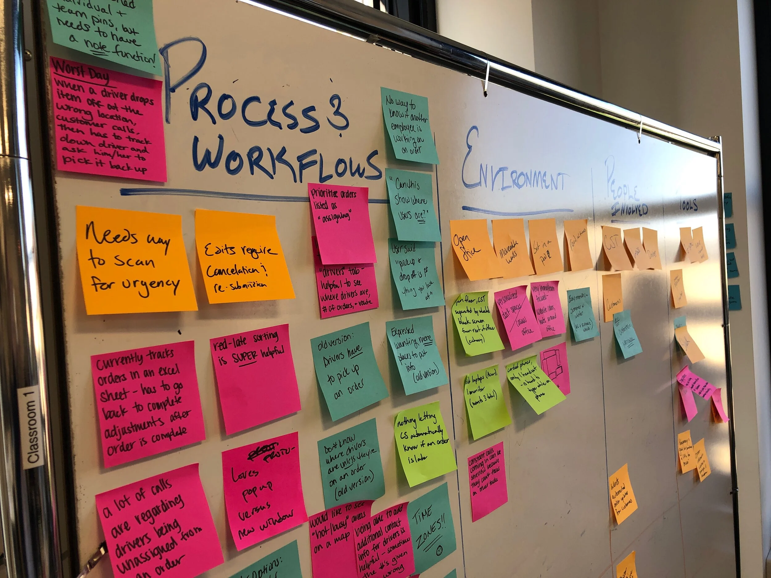
Finding themes in the data
Main Themes
Visibility of Information: status of orders, notes on orders, who is working on an order
Pathways to Information: language of tabs, structure of locating information
Sketched Wireframes - Discovering What’s Needed


The Solutions
Prototype Expansion
After sketching out several wireframes, I solidified a plan for what I wanted to address in the next iteration of the prototype. I wanted to focus on organization and efficiency in the design through the following designs and interactions:
Include notes with orders
Adjust the order “Edit” function visibility
Search for active drivers by location
Allow team members to assign orders

1. Notes with Orders
Envelope Icon adjacent to any orders with notes
Displays the notes through a pop-up window
Allows a user to add a note if needed
This function gives clear visibility of notes, and can allow a user to immediately understand the context around a particular order when assisting customers.

2. Adjust “Edit” Functions
Removed the ice cream cone icon
Brought the edit functions out onto the main order page so that they are clearly visible
Allows user to immediately edit an order if needed.
This can allow a user to take instant action on an order, and not require them to take an extra step to open up the edit functions. This may seem minimal, but for a new user, time could be wasted as they search for the edit function.
3. Drivers by Location
Search for driver specifically by state and city (see images below)
Prevents wasted motion navigating on a map
User can quickly isolate active drivers in a particular market


4. Assign Orders
Assign team members to high priority orders
Ensure any problematic orders are being resolved by a team member
View your orders plus the team’s orders within the “Your Orders” tab
Quickly see the individual workload and the team workload
Easily see who is working on particular orders with the team member icons
Prevent the situation of two individuals working on the same order


An Interactive Tour
In the scenario that I built, an employee named Katie Thompson has just returned to work after a week of vacation. She gets a call about a late order, and needs to quickly find information about the order. In the interaction, Katie finds notes with the order, assigns herself to the order, then searches for active drivers in the area so she can be proactive about resolving the late order.
A clickable version of the prototype can be viewed here:
Dispatch Prototype
Final Thoughts
Conclusion
When working with a significant amount of data, organization and visual management of that data is imperative for the user. For this project, I aimed to focus my efforts through those lenses to ensure that the CST needs were being met. Through attention to the needs of the user and finding efficient pathway to information, these recommendations will be extremely beneficial as the new CST system is finalized.
Impact
With the proposed changes that were highlighted here, the impact to the CST and Dispatch are significant. If these are implemented to help the Customer Success Team be proactive about assisting customers, this will ultimately help grow the customer base at Dispatch and increase customer retention. If customers have positive experiences with a company when a problem arises, this will demonstrate that the company cares about the customer’s needs which will build trust in the customer and lead to customer satisfaction. As this foundation of customer satisfaction is built, this will help convert first-time users into long-term customers. The cycle will continue to repeat itself which will position Dispatch in a secure place of sustainability coupled with continued growth.