
Flight Booking Website
A Case Study on a Desktop Flight Booking Website

Photo from Free-Photos on Pixabay
The PROJECT
This project was done in an effort to provide a specified user experience to an individual wishing to book a flight on a desktop website. Knowing that booking flights (and flight travel in general) is something that people do regularly, I was eager to see what information I would garner from this process. This project involved gathering initial information from users, creating wireframes, developing a prototype, usability testing and reporting on the findings following testing.
The Research
Interviewing Users
The interviewees
As I began this project, I reached out to several acquaintances who have done regular flight travel, both domestic and international, and asked if I could interview them. All were open to sharing their experiences about traveling and booking flights, and often offered personal anecdotes to give context to their situations. One who was rather indifferent about his booking experience shed some light on his last time traveling: “I was going to visit family, and to be clear, I do actually like them!”

Notes from an initial interview on the experience of booking a flight
“Tell me about the last time you booked a flight. How did you feel during the process? Was anything frustrating, or helpful? How did you feel after booking your flight? Is there anything that would have made your experience better?””
The INTERVIEW FINDINGS
The interviews for the project were a starting point to gather data about the various experiences people have with booking flights. All of the interviews were conducted in casual settings and often became more of a conversation: I would ask a question, the interviewee would answer, I would repeat the reply and ask a follow-up question to gain more insight.
While there were several similarities among those interviewed (everyone was an advocate for finding the best price possible), there were notable differences in what each person wanted out of their experience. One individual expressed wanting to know the specific type of aircraft during the booking process, and also desired to know what kind of rewards programs he could use with his flight. Another interviewee lamented about any airlines not having seating options available; as a very tall person, he intentionally looks for seats with extra room.
The USER GOAL
Based upon the interviews I conducted, I decided to focus on a flight booking website which would allow the user to search for flights coupled with various rewards programs, and allow the user to set a price alert for flights to save time on checking for the best prices. I developed the following user goal:
User Goal:
The user is an active adult who wants to search for flights plus rewards programs in the most time efficient way possible.
The Design Process
Sketching & Wireframing
WIREFRAMING
The wireframes that were built for this project were designed to help the user locate flights that would pair with any of their preferred rewards programs in addition to setting a price alert. With this in mind, I made the design for the wireframes fairly minimal in efforts to focus on the actual tasks themselves. While going through the wireframe process, I realized that there were several elements that I could have included or developed to help a user further. However, I resisted from diving too far into accounting for other scenarios and kept my focus on the tasks that would help my user and the goal that I had identified. The images below show part of my wireframing process:

A rough, first-idea sketch of a wireframe for the flight search process

The wireframe translated into Sketch, displaying the main page
The wireframes followed 2 main paths: one to allow the user to search for flights + rewards programs, and another path to set a price alert. While working on the wireframes, I separated the wireframes into the 2 tasks to help myself focus on the design for the specific functions within the website. Below shows how the wireframes evolved from being low-fidelity to gradually including more information to help a user see the functions within the website. This then influenced the development of the prototype. The wireframes were produced in the program Sketch.


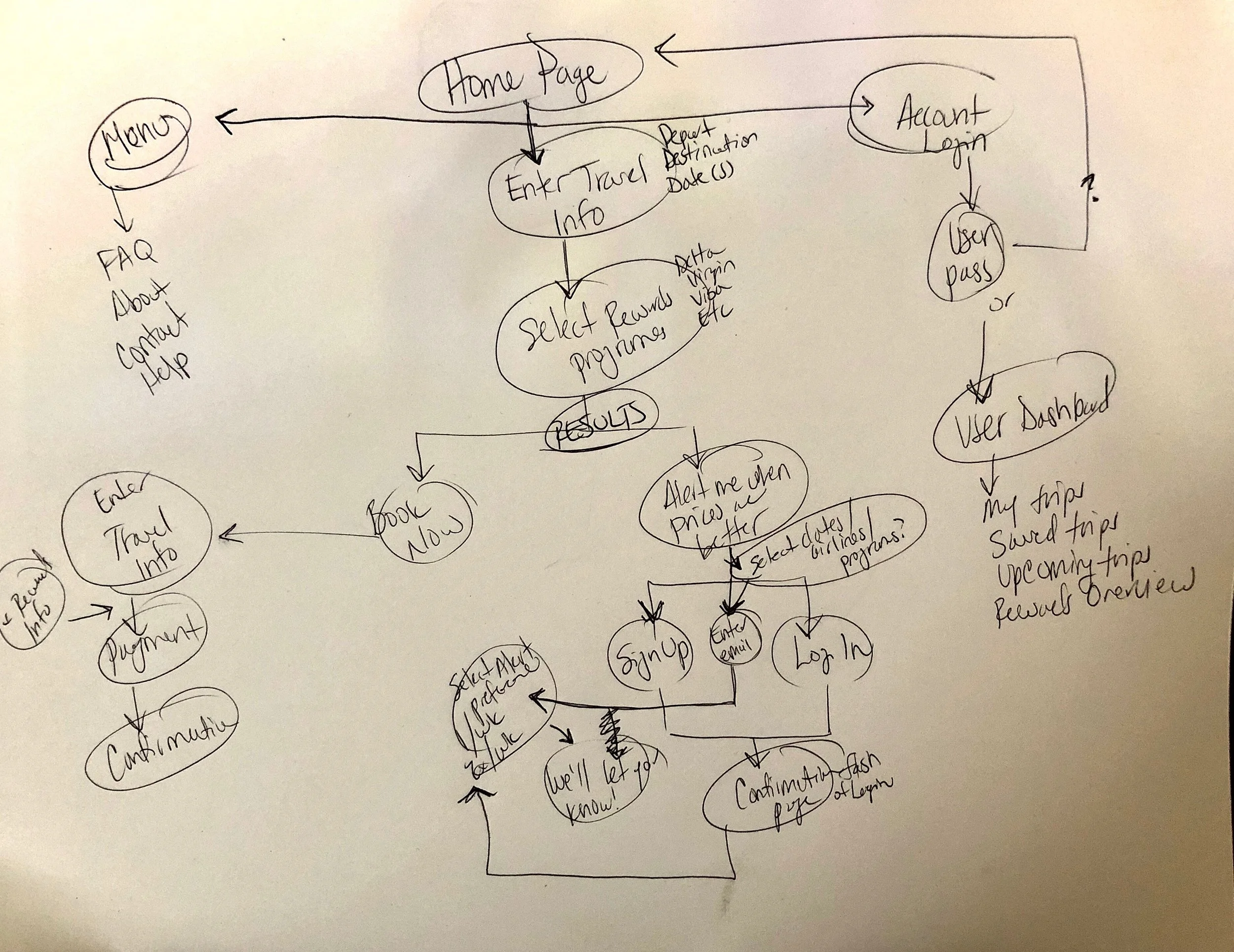
Information Architecture & User Flow
Once the wireframes had been constructed for the website, I developed a user flow to show the pathways that a user could take to complete their tasks of searching for a flight + rewards program, and setting a price alert for themselves. Overall, the user flow was fairly straight-forward because it was dependent upon a user entering and/or selecting information to progress to the next page.
The Prototype

The hotspots show the starting navigation requirements on the main page of the prototype
structure & building

A screenshot of the hot-spotted prototype in Axure
The prototype was built in the program Axure, and was based upon the highest-fidelity wireframe that was made for the project. Since the project had a limited scope - being that it was focused around completing a certain task(s) - the prototype was also somewhat limited.
When building the prototype, I chose build out the main areas that were going to be tested. I wanted to specifically see how users interacted with the functions that would allow them to complete their given tasks, and what reactions users would have. The prototype was several pages, and somewhat low-fidelity. For this iteration, I relied upon a simplistic design and icons to guide the user through the steps in the site.
The live prototype can be viewed and used at the following link: Flight Website Prototype
Usability Testing
The participants

A page from the final report identifying the backgrounds of the test users
For the usability test, I had 3 individuals for the test. All of them book flights at least once a year; several said that they will typically book a flight a few times in a given year. These users navigated through the site and completed specific tasks given to them.
the test tasks
During the usability test, the participants were instructed to do the 2 following tasks:
Search for a flight and rewards program
Set a price alert for yourself

A test user searches for a flight while enjoying a flight
the test session
Prior to each test, I took time to explain the scope of the project to each test user and introduced the test. All of the test users were familiar with the fact that I was taking a UX Design class, and understood that the test was for a class project. As I introduced the test, I did my best to communicate that they would be using a prototype, and that not all functions were built in it. Most seemed to understand, however, all users were curious to explore the prototype and see what worked. There were points when I was required to neutrally guide the user back to the specific task. For a future usability test, I’d like to make the prototype as robust as possible.
Results from Testing
pain points
After reviewing the results of the usability testing, it was evident that elements of navigation were the biggest pain points for the users as they went to complete their tasks.
A major part of the design that I wanted to ensure was clear to users is that they could utilize the website without needing to sign up for an account. However, it was proven that this design was not successful for that message. This was noticeable on the “Step 1” page (see image A) as 2 of the 3 users bypassed the “Next” button entirely and instead clicked on “Login” or “Create Account”. Initially, I had thought that the blue color of the “Next” button would be visually catching to the user, and draw their eyes to it. Users, however, only looked at what the next immediate buttons were, and focused solely on those. It took some neutral guidance from myself to help the tester find the correct pathway; rather than saying “Click here”, I subtly prompted each user by asking “Is there anything else on the page that you can click?” until they clicked on the “Next” button.

Image A - the “Next” button was overlooked by users on this page

Image B - the calendar icon was the preferred method for selecting a date
It may have been prudent to not hotspot the “Login” and “Create Account” buttons in the prototype as a way to force the user into clicking the “Next” button to allow them to progress through the Set Price Alert process. However, I decided against this since I wanted to discover how a user would truly use the site: would they navigate through easily by clicking on the “Next” button, or would they attempt to “Login” or “Create Account”? The results proved incredibly informative and helpful, and identified an area that needs improvement.
Another pain point that arose out of testing was seeing users attempt to use a calendar icon as a way to select a date, as opposed to the text field that was adjacent to it. I observed how users clicked directly upon the calendar icon, and did not navigate to the text field (see Image B). It was clear that users have a habit of using a calendar icon as a selection tool.
Also during the usability test, it was evident that one of the elements I had overlooked was a back navigation option. Since I was so focused on how a user would progress forward, I didn’t adequately account for a situation in which a user would want to go back. I identified this as one of the major pain points for the user, and listed it as an area for future improvement in the next iteration.
The positive outcomes
While there several problematic items that were the result of the testing, there were several positive reactions to features of the website. It was clear that some features built into the site were genuinely appreciated by the users, and helped prevent them from potential future frustration. One in particular was the function to set a specific stop date for a price alert. A test user had the following comment about this feature:
'Okay, now this I like! I can set a stop date for my alert without having to manually go back [to the website] later and update it.’ - User 1
When I considered the needs of the user in the context of setting a price alert for a flight, one of the important parts of this would be a stop date for the alert. All of the interviewees from the research phase of the project indicated that they had specific dates in mind when searching for a flight. It then made sense to build in a stop date requirement for a specific trip, rather than alert to continue indefinitely.
Another feature of the site that users appreciated was a function to set an alert whenever a price falls below a specific amount.
‘Oh, that’s cool - you can set an alert whenever the price drops below a certain amount.’ - User 3
This was built as an option that a user could select when setting their price alert preferences. Users responded positively to this feature as they went through the process of creating a price alert for themselves.
Recommendations
Following the results of the usability testing, I examined each of the main problems that I found and presented recommended solutions for a future re-design. The website is reliant upon clear navigation in order for the users to be successful, which the usability test revealed. Since the navigation is so crucial for a user to be successful and often resulted in some frustrations during testing, I recommended that the following 3 items be revised in the next iteration:
Re-position the “Next” button on step 1 of the alert process - since this proved problematic for users and is a key part of how a user progresses through this process, this needs to be re-examined. I would suggest that the next button is moved into a more visually prominent position so that the user sees it right away. The “Login” and “Create Account” buttons should be moved down the page, and perhaps be re-sized so that they appear smaller.
Update the Calendar icon - after witnessing users repeatedly try click on the calendar icon to select a date rather than attempting to use the neighboring text field, this icon should be updated to allow a user to select date from it. Based upon how users were interacting with the calendar icon, a future iteration should bring up a full calendar once the icon has been clicked, and allow a user to select their preferred date(s). The selected dates should then display in the text fields.
Include Back Navigation - in the first version of the prototype, sufficient back navigation was not included in the design. This proved frustrating for users when they wished to go back a page to view their options. A future iteration should include clear back navigation, and could potentially be paired with a crumb trail so that users can clearly see their place within the process.
By updating these navigation elements, it’s estimated that this should improve the user’s experience when utilizing the website and increase the success rate of users being able to complete their specific tasks with ease.