Improving Navigability
A Website Re-Design Project

Overview
Introduction
Minnesota Compass is a non-profit organization that provides civil information to the public and their website curates data about the state of Minnesota on a wide variety of topics. To engage more users, they wanted to receive recommendations on how their site could be improved. By ensuring that the website can be easily used, this will encourage return users to visit more frequently and also convert first-time users into regular visitors.
The Website
The Minnesota Compass website operates as an online, open-source database, and stores a significant amount of data about the state of Minnesota. The data ranges from demographical data to recent trends across cities and the state.
The Challenge
My team and I were consulted to improve the navigability, findability and attractiveness of the Minnesota Compass website. The amount of data stored on the site is impressive and provided the greatest challenge. To guide our efforts, we needed to discover specific pain points to understand where to set our focus for the re-design.
The Solution
My proposed solutions to Minnesota Compass were to improve the clarity of their language used on the website and to re-structure the organization of information. By providing clear text and direct pathways to information, the information provided on Minnesota Compass will be much more accessible to its visitors.
Methods & Tools
Heuristic Analysis | Comparative Analysis | Usability Testing (remote + in-person) | Sketch | Axure
Personal Reflection
When approaching this project, I brought the ability to quickly identify the key areas that needed improvement and bring focus to them. By doing this, I was able to discover a set of recommendations for Minnesota Compass that would improve navigation within the website and that were feasible. I enjoyed being able to look at a seemingly insurmountable task and discover small steps that would have a big impact.
Client & Users
The Project
Navigability is a key component of any website, and knowing that Minnesota Compass wanted to improve the navigability, I wanted to discover what areas were problematic with its current navigation. I took time to explore the website to try get an understanding of its purpose, and to envision the type of user that might visit the site.
Users
Policymakers
Business professionals
Community leaders were considered to be the primary users.
I conducted my own usability review as well as a usability test to determine where the major pain points were so that I could address them in my final recommendation.
The Goals
As I began this project and determined the process for assessing the website, I identified the following goals for my evaluations:
Efficiency of Navigation - how quickly can a user find information
Pathway of Navigation - to understand how a user navigates within a website where multiple pathways exist
Trust - to determine if users find the information on the website credible
Content - to understand what users want to see on the website
The Process
Heuristic Analysis - Finding What Exists
To get a better understanding of how the website operates, I conducted a heuristic analysis to scope out what worked well and what didn’t work well within the site. I used the following criteria for this analysis:
Consistency
User control
Reduce user’s minimum steps
User knows where they are (Recognition)
Avoid obtuse language
Aesthetic UI
New Information is presented with meaningful aids to interpretation
I use two scenarios for the analysis: to look up a specific statistic (for example, the number of voters in the city of Brooklyn Park) and to look up an article. Both seemed like simple enough tasks, and I wanted to see if that theory was true as I went through the website.
To score the analysis, I did it on a point system and gave each heuristic a rating on a scale from 1 to 5. Overall, the website scored low-to-average with each heuristic, but Reduce user’s minimum steps scored the worst. It was immediately evident that navigation was a problem, largely from the amount of content that displays on pages and its organization.

A screenshot of the heuristic analysis and their rations, including the final score out of 10
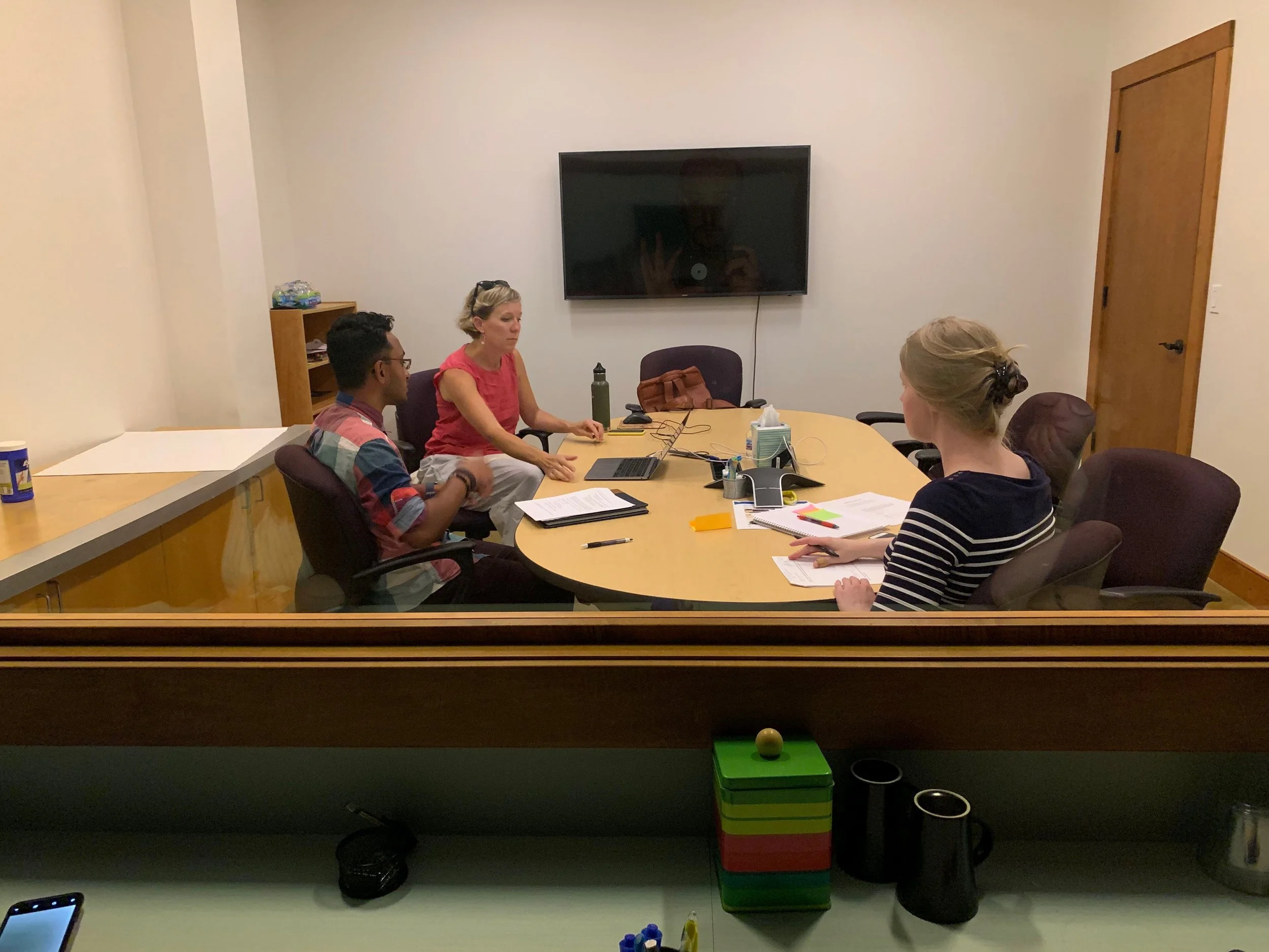
Usability Testing - Discovering the User’s Needs
To further explore how an individual would use the Minnesota Compass website, I conducted several usability tests, both remote and in person. The tests were structured in the following manner:
First Impressions
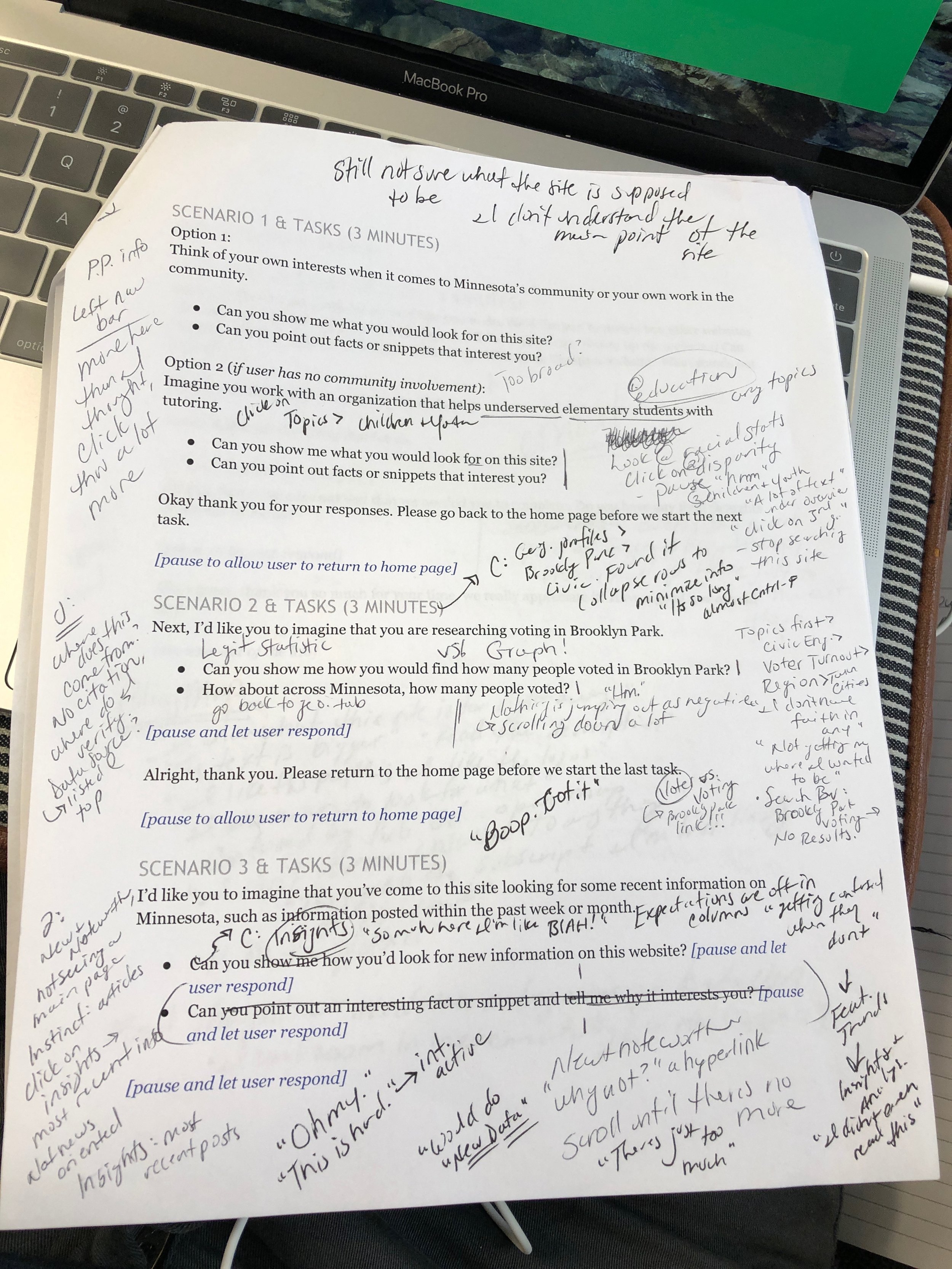
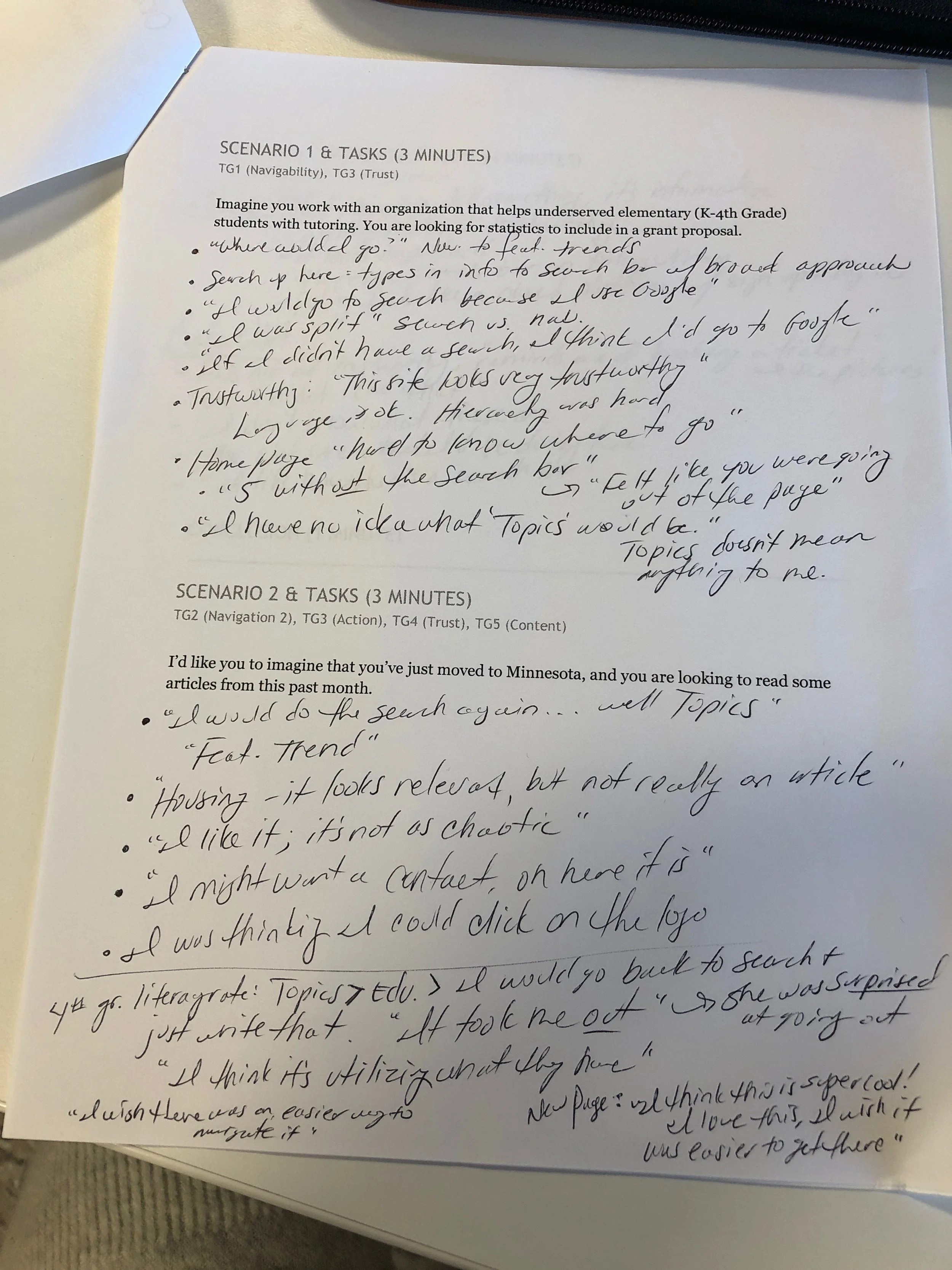
Scenario 1 - look up average literacy rates in Minnesota
Scenario 2 - look up the number of voters in Brooklyn Park
Scenario 3 - locate a recent article
Final Thoughts
For my remote tests, I selected three friends who have all worked, either present or past, in some field relating to civic policy or business. The tests with these users ran from about 30 to 45 minutes each.
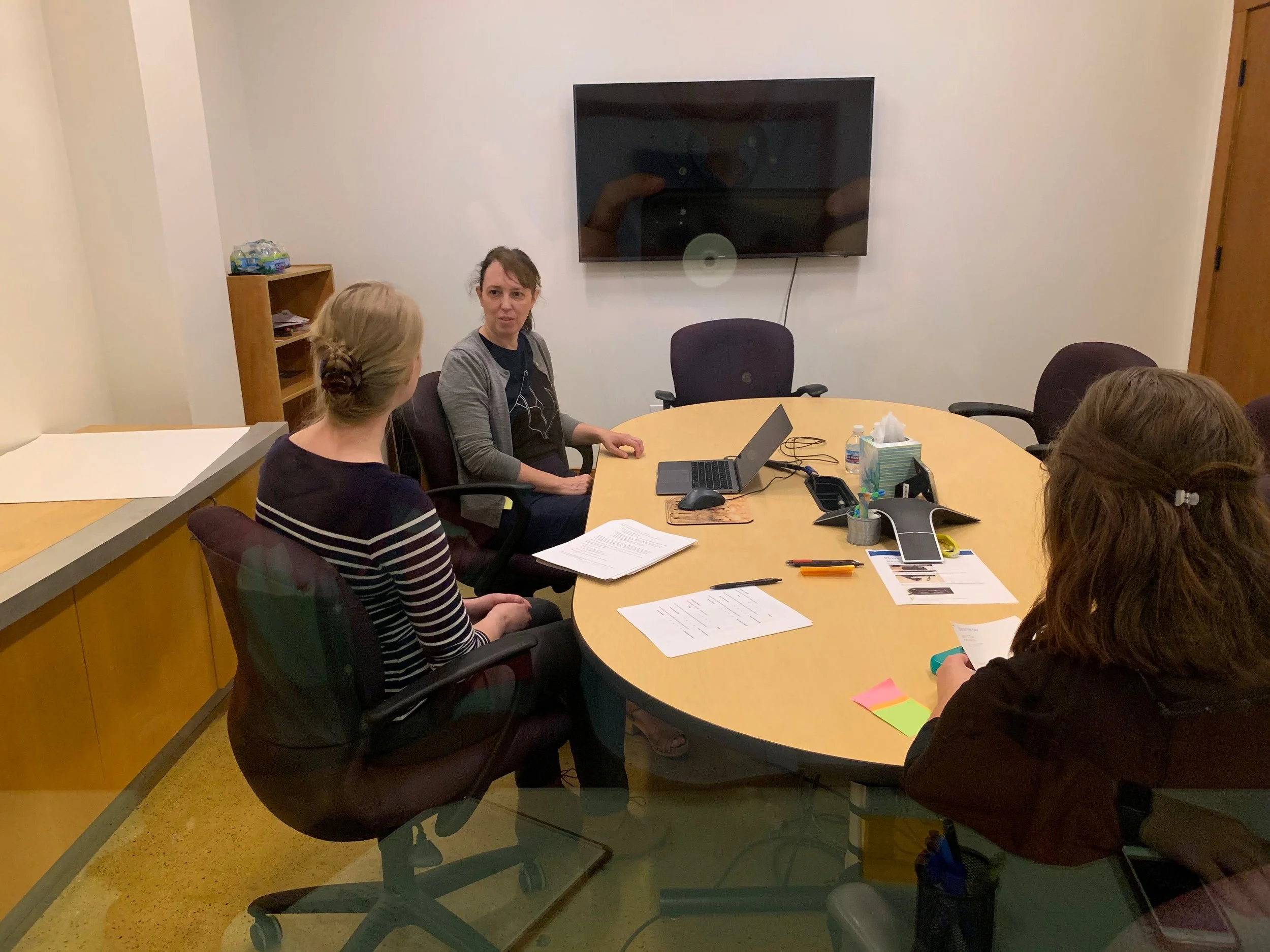
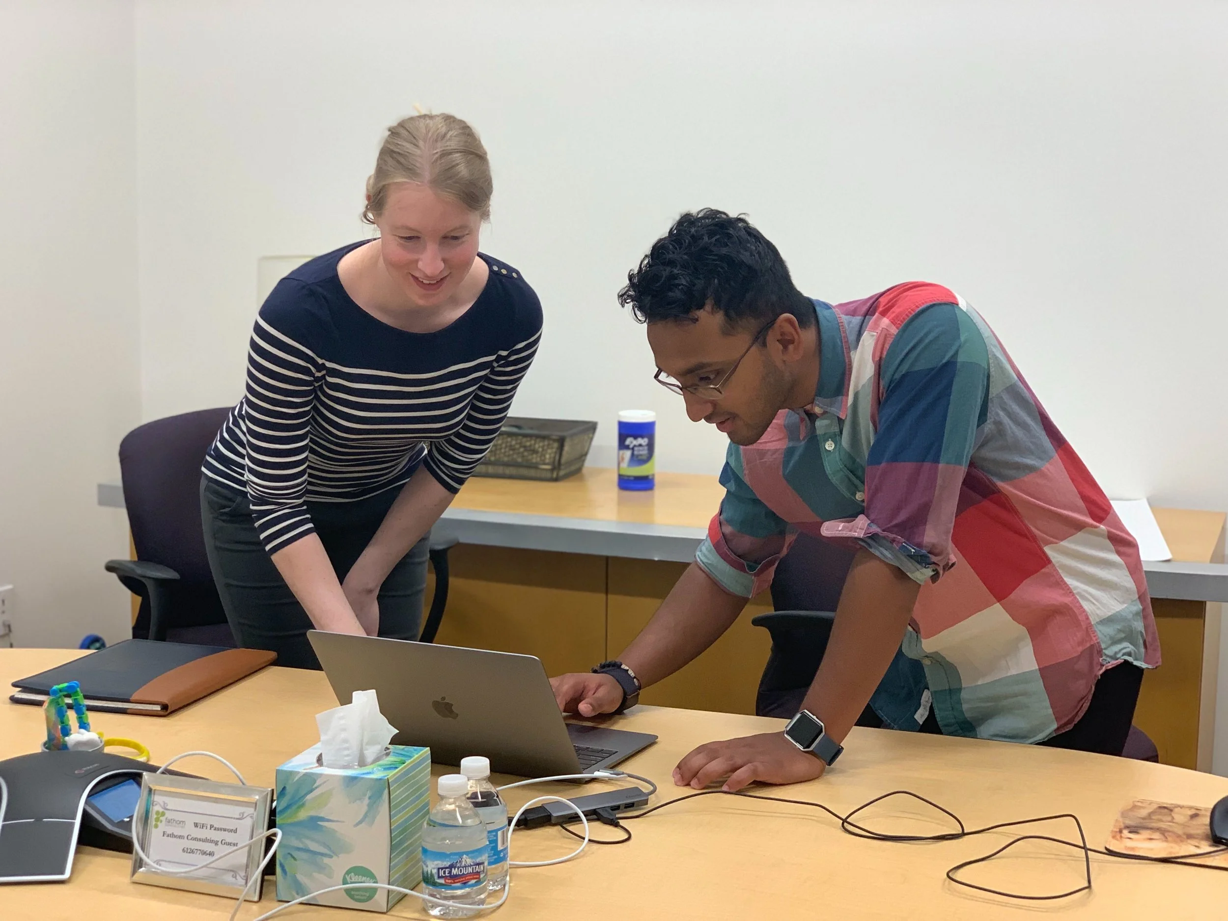
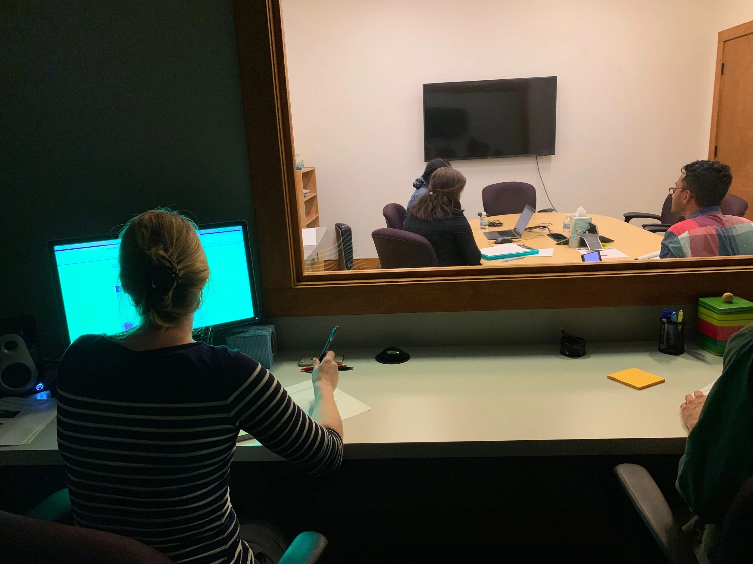
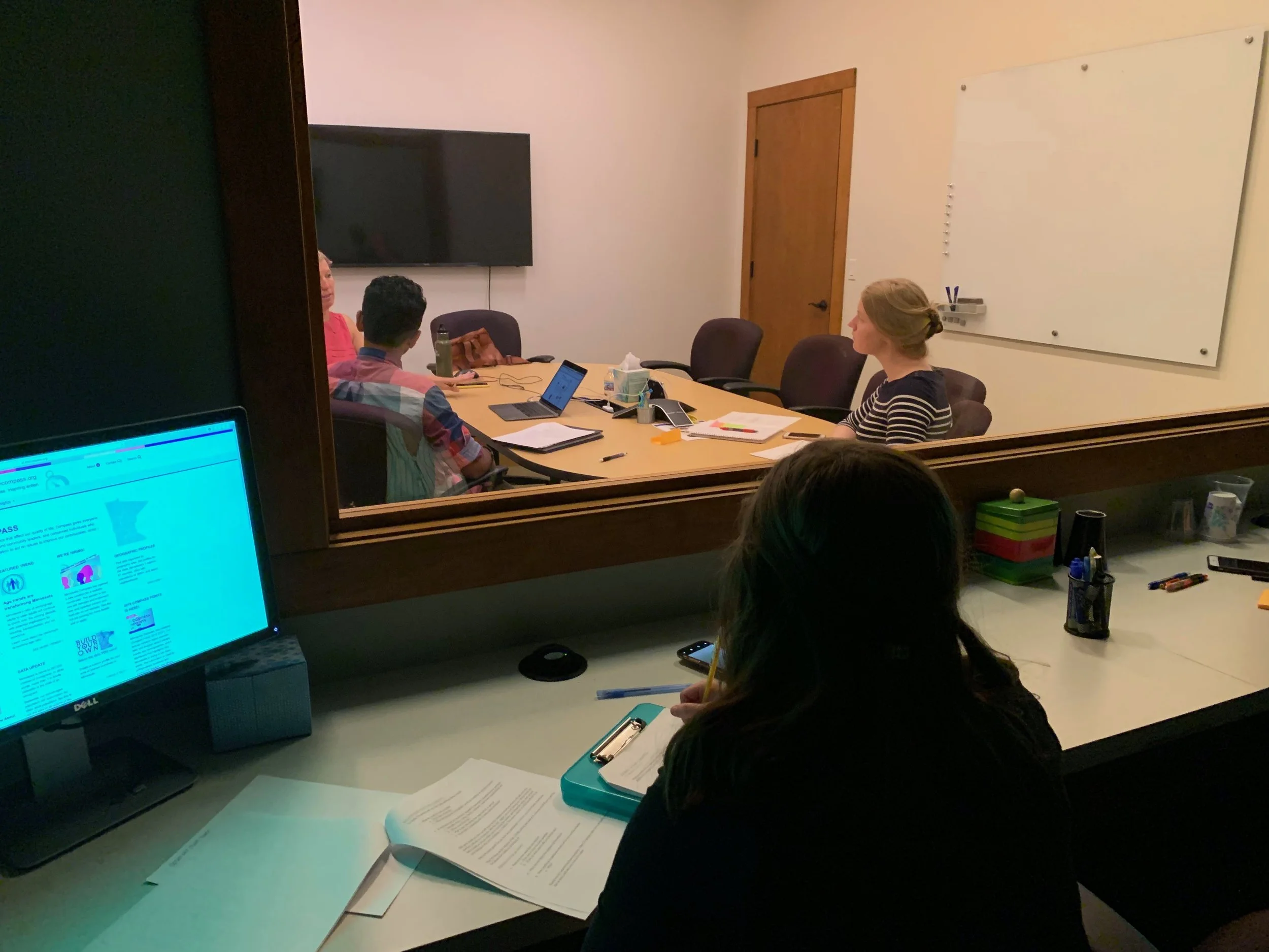
The in-person tests were conducted in a lab with my team members on the project. We conducted four usability tests, and each test had a moderator, a note-taker, and an anonymous observer in a separate room. Each in-person test was given a strict 20-minute time frame. My team also presented each test user with a brief survey to rate their experience using the website.
The Findings
The results of the usability tests proved that there was a noticeable issue with the navigation of the Minnesota Compass website, and this stemmed from the organization of information on the webpage as well as ambiguous language used on key navigation points. While multiple users expressed their appreciation for the information that Minnesota Compass provided, they also admitted to having difficulty when using the website. Below are several key findings from the usability testing:
Ambiguous Language
On the site, there were often instances when a user would have to decide which pathway to take to access the information they wanted. For example, when looking up elementary school literacy rates, several users paused and had to choose between the topics of Children & Youth or Education. Another user acknowledged how there are multiple ways to access information within Minnesota Compass, but this can prove problematic if it causes the user to think more than they should as they navigate the website.
“Am I using this [website] in the best way? That’s a constant question in my head. - User 1
I have no idea what ‘Topics’ would be. ‘Topics’ doesn’t mean anything to me. - User 2 ”

2. Text organization
Another cause of navigation difficulty was the high density of text on the webpage. This caused users to feel overwhelmed as they used the website. Often, users were forced to read through all of the presented text to find the information that they wanted. Users commented that there was “Small text and too much of it” as well as “It’s so long…there’s too much.” Having too much information was causing difficulty with navigating because users were simply overwhelmed by trying to comprehend all of the text, and to then determine the best path for accessing information.
3. Recognition
One of the more problematic areas for new users was recognition of the purpose of the website. In looking at the main page more closely, there is no guiding text to clearly state to the user what Minnesota Compass is for. Upon visiting the website, one user stated “I don’t understand the point of this site.” This was concerning to hear; if a user can’t understand the purpose of a website immediately, it’s likely that the user would abandon the site entirely.
4. Credibility
A value of Minnesota Compass is to be a reliable source of data for its users. However, during testing, it was evident that their sources are not clear enough for users to identify. While researching for a voter statistic, one user wondered aloud about the source: “Where do I verify the data source?” If Minnesota Compass wants to be a credible source of information, this needs to be more prominent and was noted as an area of concern on the website.
The Solution
Following the usability testing sessions, I took time to review the data and develop recommendations for improvements to the website. These were the suggestions that I proposed for improvements:
Improving Navigability - Language
My first recommendation is to edit the copy on the website for clarity. Given the multiple instances in which users were unsure of how to select a pathway due to the language, I suggest that the language be updated and optimized for as much clarity possible.
Improving Navigability - Organization of Information
To help the user avoid the situation of having to process too much information, I suggest segmenting the information on the pages, and developing links to separate pages. This will prevent the issue of needing to include all information on one page,
Improving Recognition
When visiting a website, it is vital that users know where they are, and more importantly, what they can do there. By including a brief introduction about the Minnesota Compass website, this will allow users to understand the purpose of the site and how they can use it.
Credibility
Since Minnesota Compass wants to be a reliable source of information on the state of Minnesota, I recommend that measures are taken to improve the visibility of the data sources. This could be done in several ways: a large introduction could be included on all pages that feature information, or citations could be included alongside data.
Key Findings


Findings & Recommendations Report for Minnesota Compass:
Minnesota Compass Report
Final Thoughts
After working through the Minnesota Compass website, it was apparent to me that they provide a service which many people appreciate and value. However, through some minor improvements, the site can become easier for a user to utilize. The changes that I suggested are relatively small, but together they could make a big impact on the user’s experience when they visit the website. By making information clear and readily available to users, the website will be able to guide users to using the site in the most efficient way possible.
The Next Steps
Following the completion of the usability tests, I had the opportunity to develop a prototype that implemented some of the recommendations that I had proposed. The prototype was relatively simple, yet identified the key areas where improvements could be made. I focused on re-organizing information and improving the language used on the site.
Below are screenshots displaying the changes that I implemented. The left image shows the main landing page, which now includes an introductory statement about the website to let users know immediately what it is for. Additionally, a prompt to enter the database is immediately available to the user. The image on the right then shows how the database is organized; users can either search for information by a city or select a subject to explore.


In the prototype, I took efforts to segment information and demonstrate how information could be sectioned off and put into its own page. This would eliminate the need for a user to digest all of the information on the site to try and find the information that they need. By categorizing information with topics and subtopics, users can narrow in on the subject that they are researching.
My goal with the prototype was to try simplify the website, through both organization and content, as much as possible. With making the webpage easier to digest through clarity of language and categorization of content, it was my aim to help the user access all of the information that Minnesota Compass provides.