Workforce Management
Transforming the Mobile User Experience
Project Overview
Duration: 12+ months
Scope: redesign the main mobile experience for WFM (clocking on/off, requesting time off, scheduling, etc) to be more modern, intuitive, and user-friendly
Stakeholders: Product Managers, Sales, Development Managers
Activities: internal stakeholder interviews, customer interviews, contextual interviews, wireframes, mock-ups, prototypes, usability sessions
Deliverables: wireframes, mid-to-hi mock-ups, prototypes
Outcomes: designs coded & delivered as the default product; ongoing refinement and designs continue with the WFM design team
The Problem
“No one has software that’s 7 years old anymore. This is the tool your employees touch 4x a day. You’re in it all the time; it needs to be simple.”
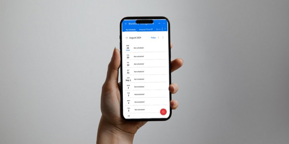
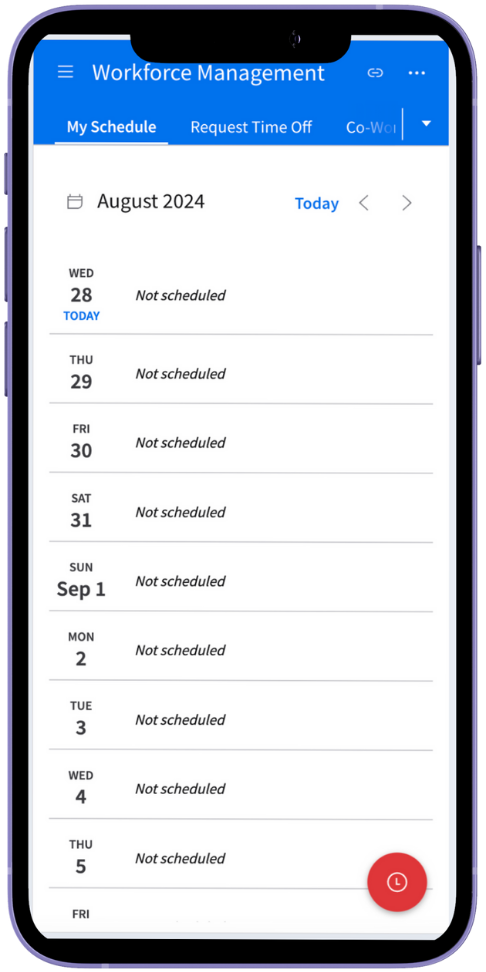
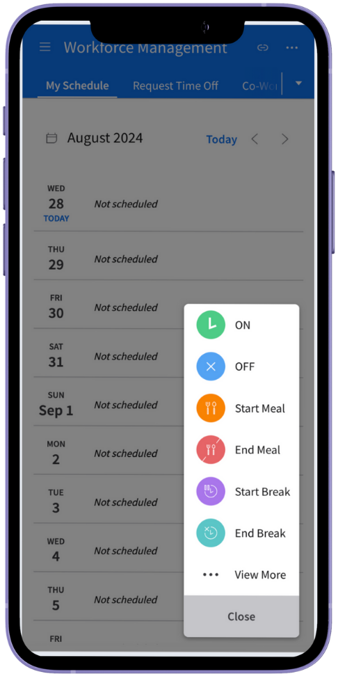
The WFM mobile application is a digital tool for shift-based employees who need to manage their work. The primary action is clocking in and out for shifts to log time worked, but also includes checking schedules, requesting time off, swapping shifts with coworkers and more.
The product suffered from noticeably dated UI and complex processes required to complete basic tasks, resulting in an experience that was dull and cumbersome for a casual user.
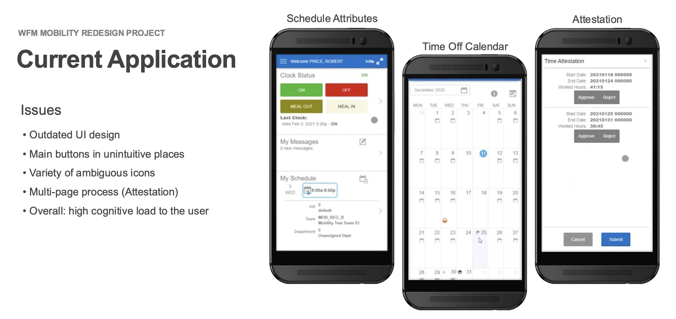
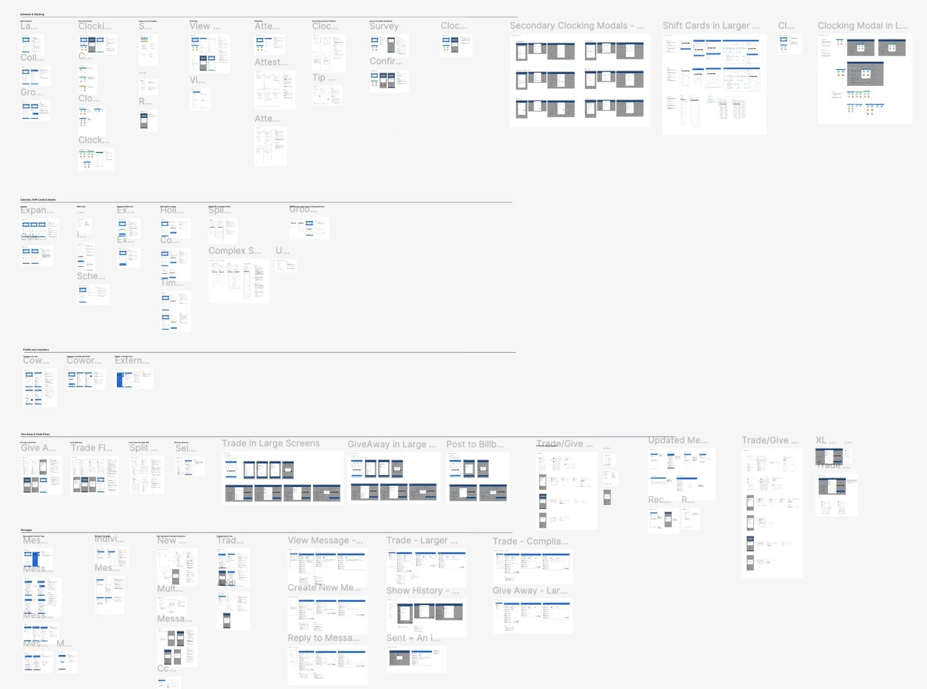
A summary showing the problematic UI within the existing WFM mobile experience
Requirements
Primary tasks to improve:
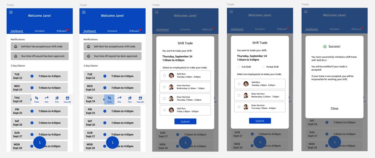
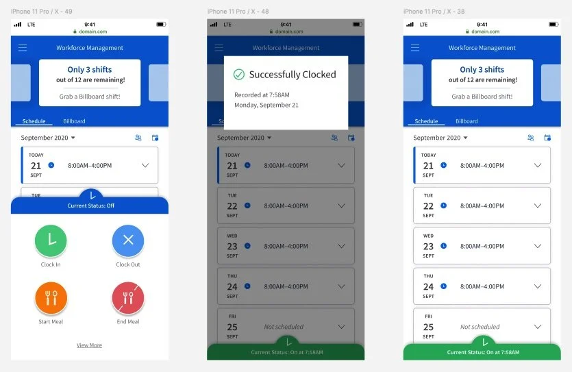
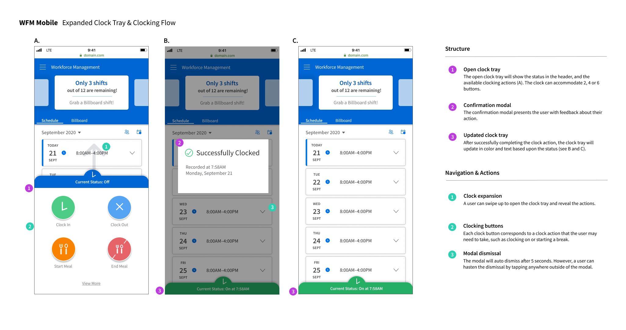
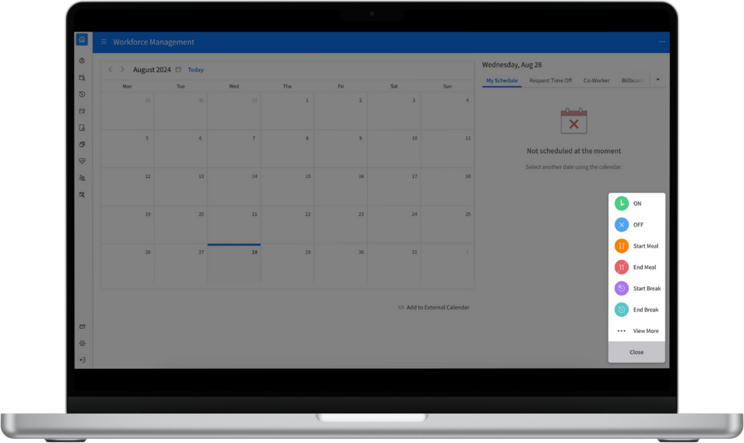
Clocking actions (clocking in, clocking out, breaks)
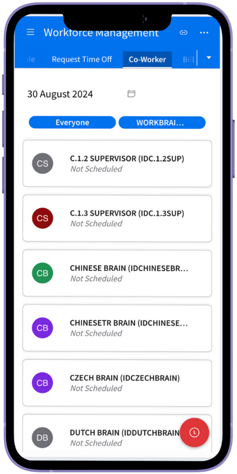
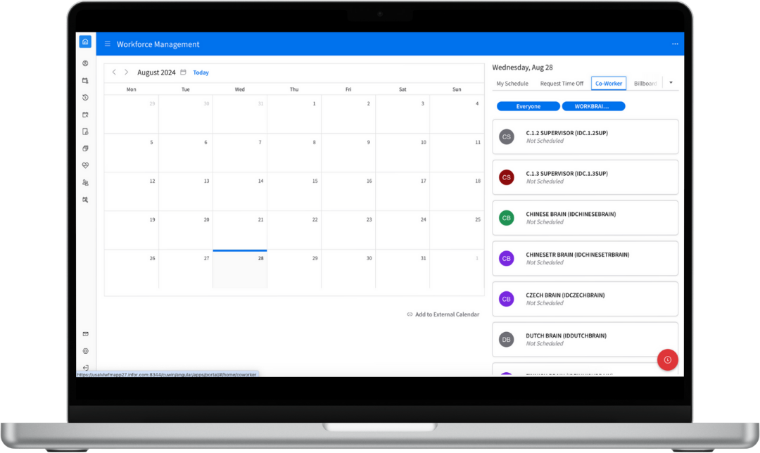
Schedule details (shift details, coworkers)
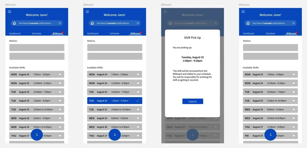
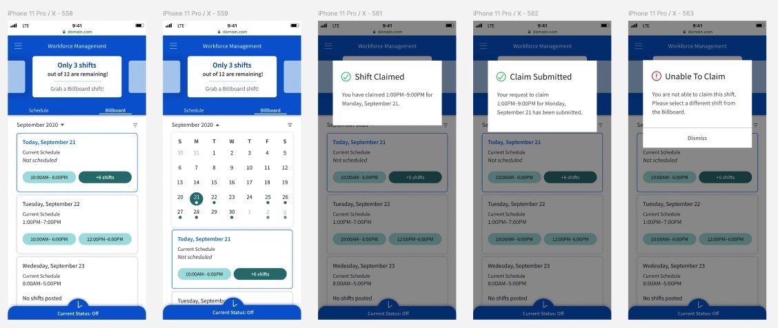
Billboard (viewing shifts, picking up & posting shifts)
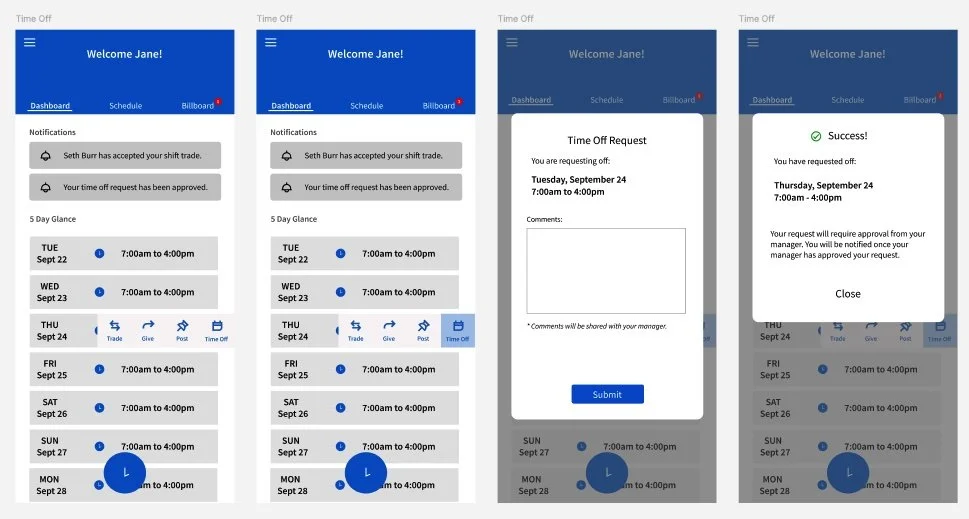
Time Off (requesting and viewing time off)
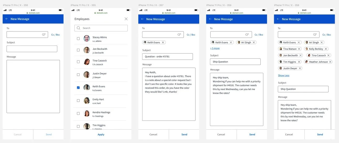
Messages (in-app messaging system)
Other Requirements:
Adhere to the Infor Design System standards
Account for responsive design
The Work
The work involved for this project was extensive, starting with gathering information from internal stakeholders to conducting usability reviews. Details of the project are summarized in the following parts:
Part 1 - Stakeholder Interviews
Part 2 - Initial Wireframes + Usability Sessions
Part 3 - Solution & Hi-fi Design
Part 4 - Responsive Design
Part 5 - Customer & User Feedback
Part 6 - Development & Hand-off
Part 1 - Stakeholder Interviews
“People are happy to have these types of conversations, and it’s long overdue.”
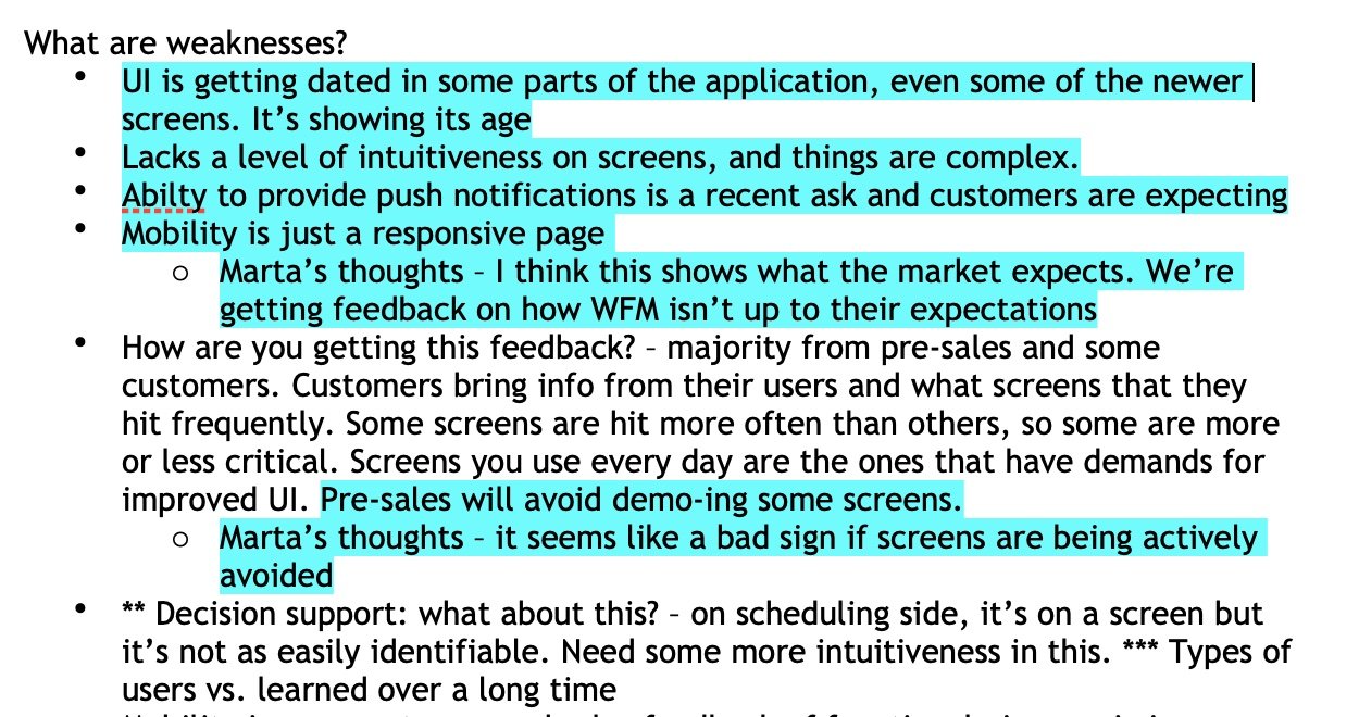
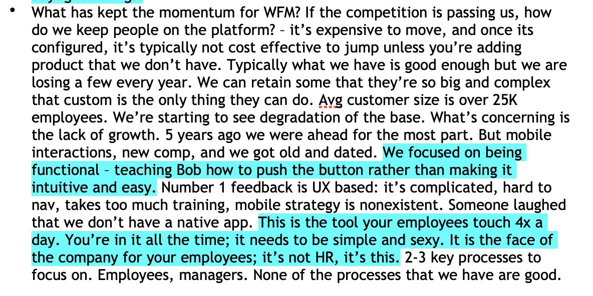
The project began with several interviews with 9 stakeholders, including Sales, Development Leaders, and customers. In speaking with these individuals about the product, my team was able to gain insight into what was advantageous about the WFM product and what was a challenge.
What our stakeholders had to say…
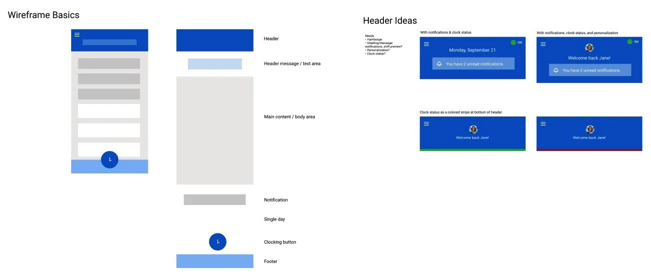
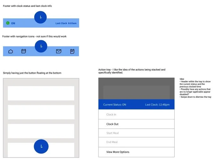
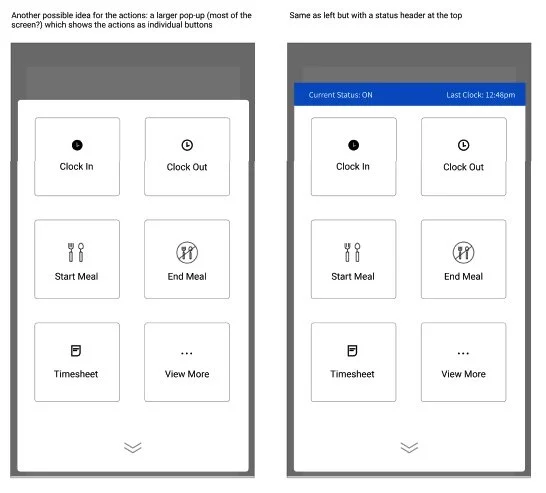
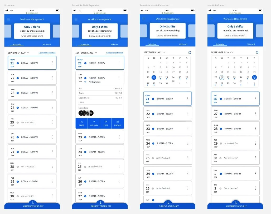
Part 2 - Initial Wireframes & Designs
Following the stakeholder interviews, I explored wireframes to determine the foundation of the design, then progressed to mid-hi designs. I conducted design regular reviews with my Design Lead and Product Manager for refinement.
Internal Grassroots Usability Mission
Time to test… with what we’ve got!
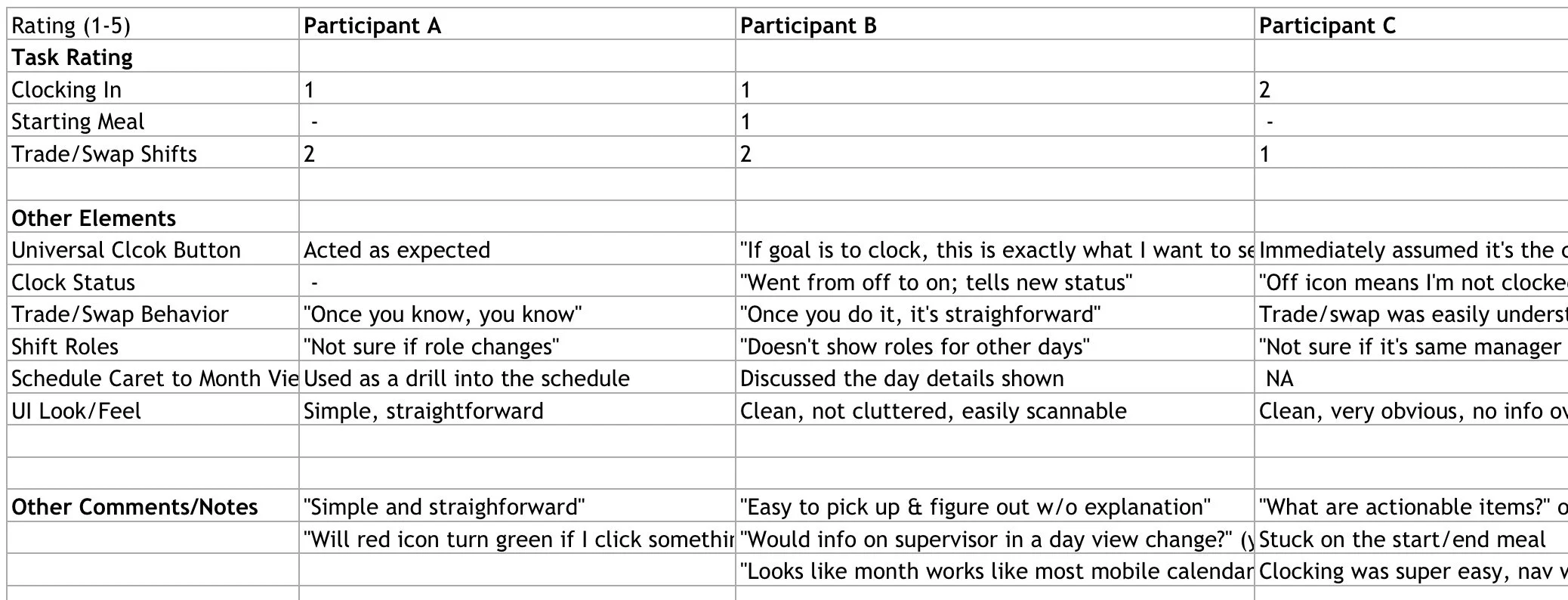
The initial designs were tested in a grassroots manner with internal colleagues to understand how successful a non-user would be using the application. This grassroots usability campaign allowed us to gather feedback on what was working well in the designs, and helped us identify what needed further refinement.
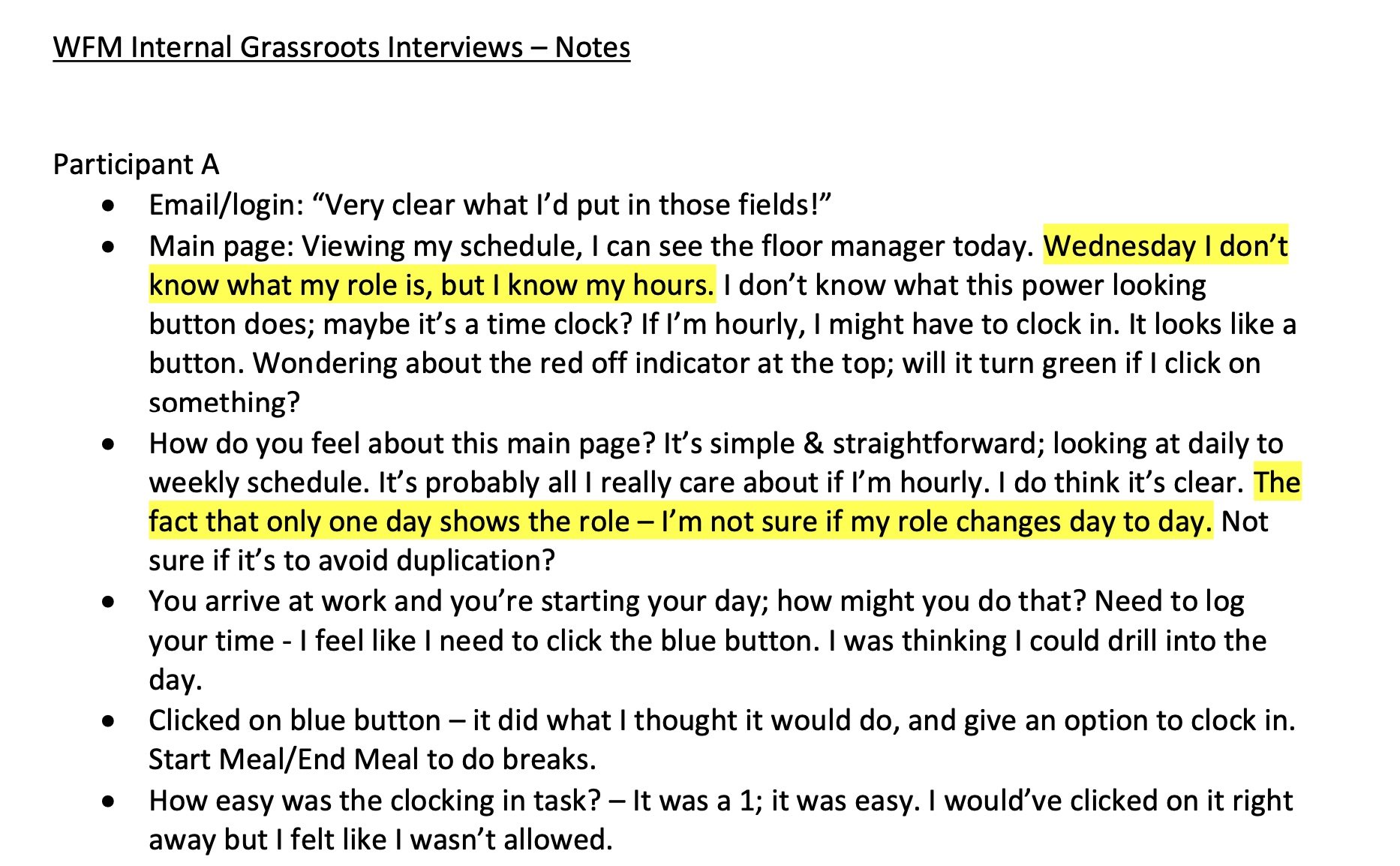
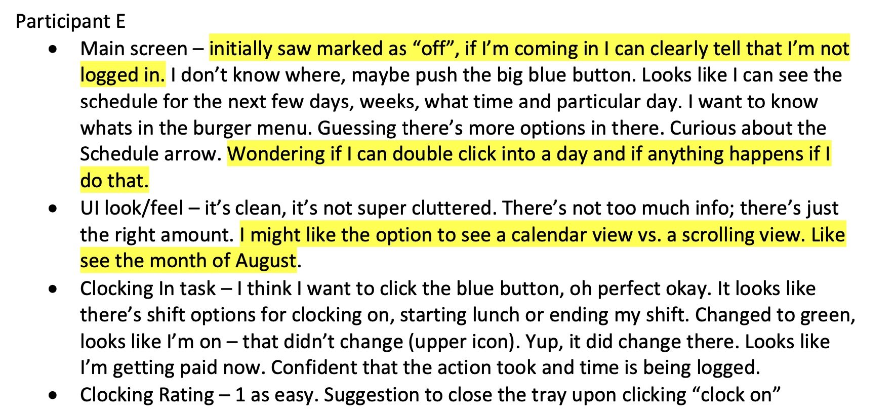
We collaborated with 11 internal colleagues who were not directly familiar with the WFM product. Notes were collected in each session, and we had our test users rate on a scale of 1-5 how easy or difficult a task was to complete (1 being easy, and 5 being difficult).
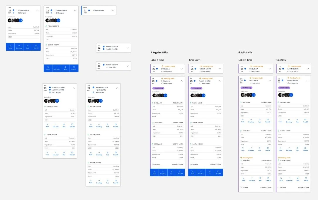
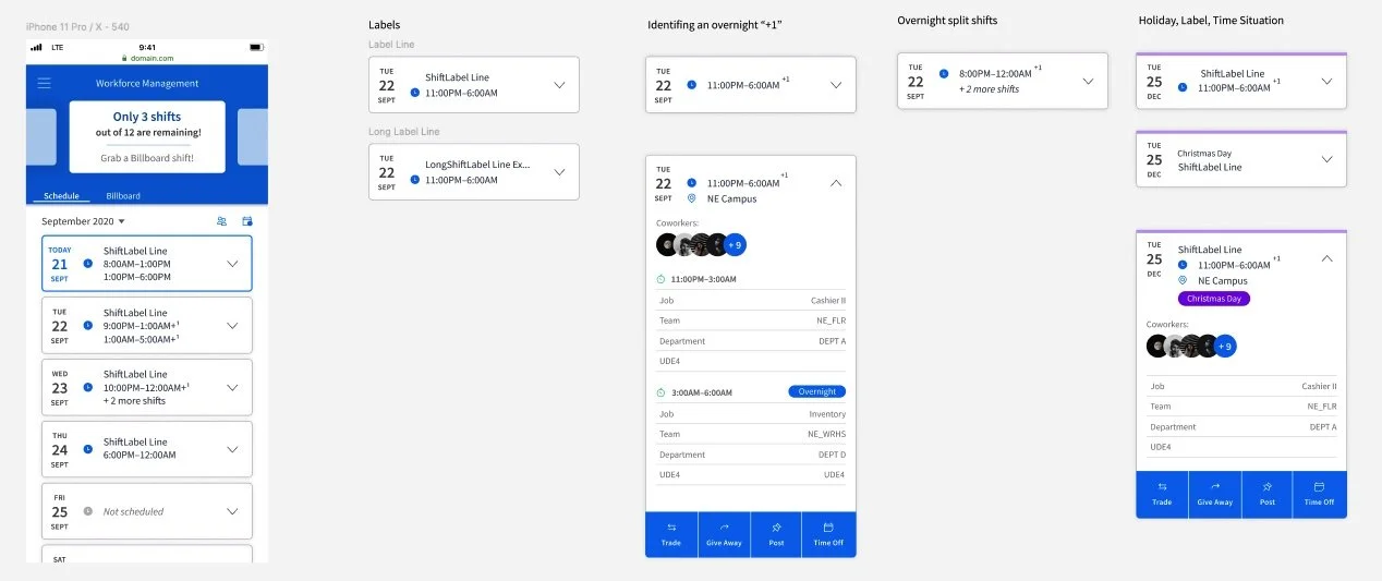
Part 3 - Solution & Hi-fi Design
After finalizing the foundation of our design, I began to incorporate further requirements that were provided by my Product Manager. We went through numerous rounds of reviews and feedback, continuously considering the requirements, their importance, and how they could be presented in the app. Multiple design rounds took place as we continuously refined the design.
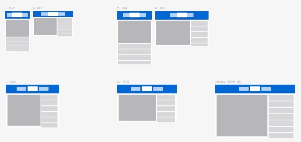
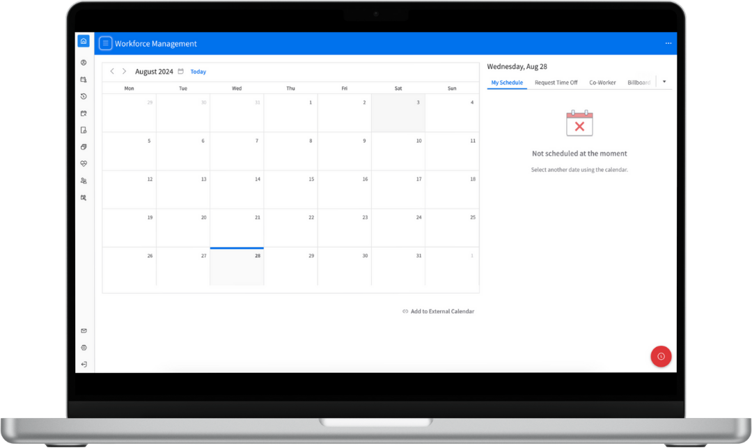
Part 4 - Responsive Design
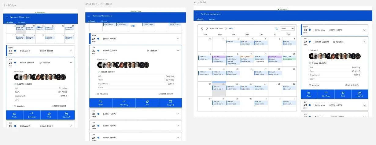
While the primary focus of this project was the mobile experience, we had to ensure the new designs could respond for a tablet or desktop experience. This effort began with wireframes to block out the main design components for a variety of screen sizes and orientations:
Once we had a general idea of how the screens would render, we incorporated the detailed elements:
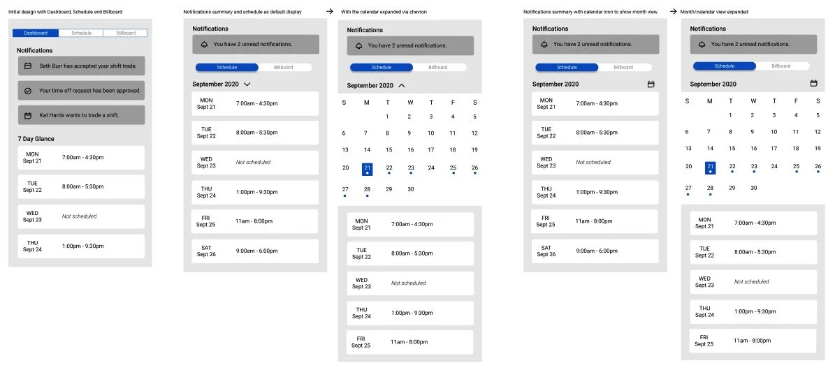
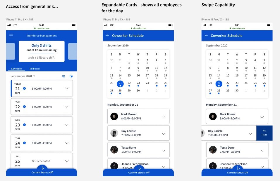
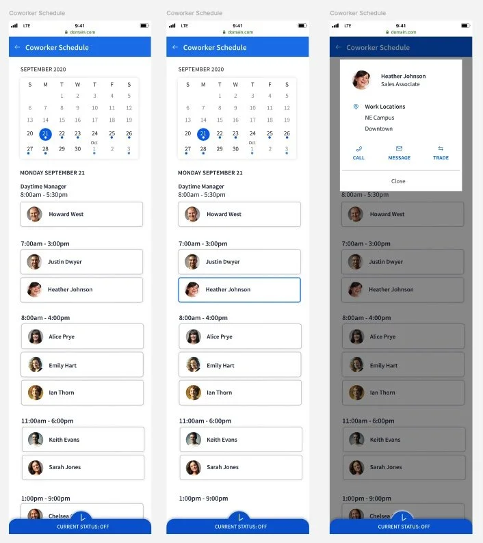
Part 5 - Customer & User Feedback
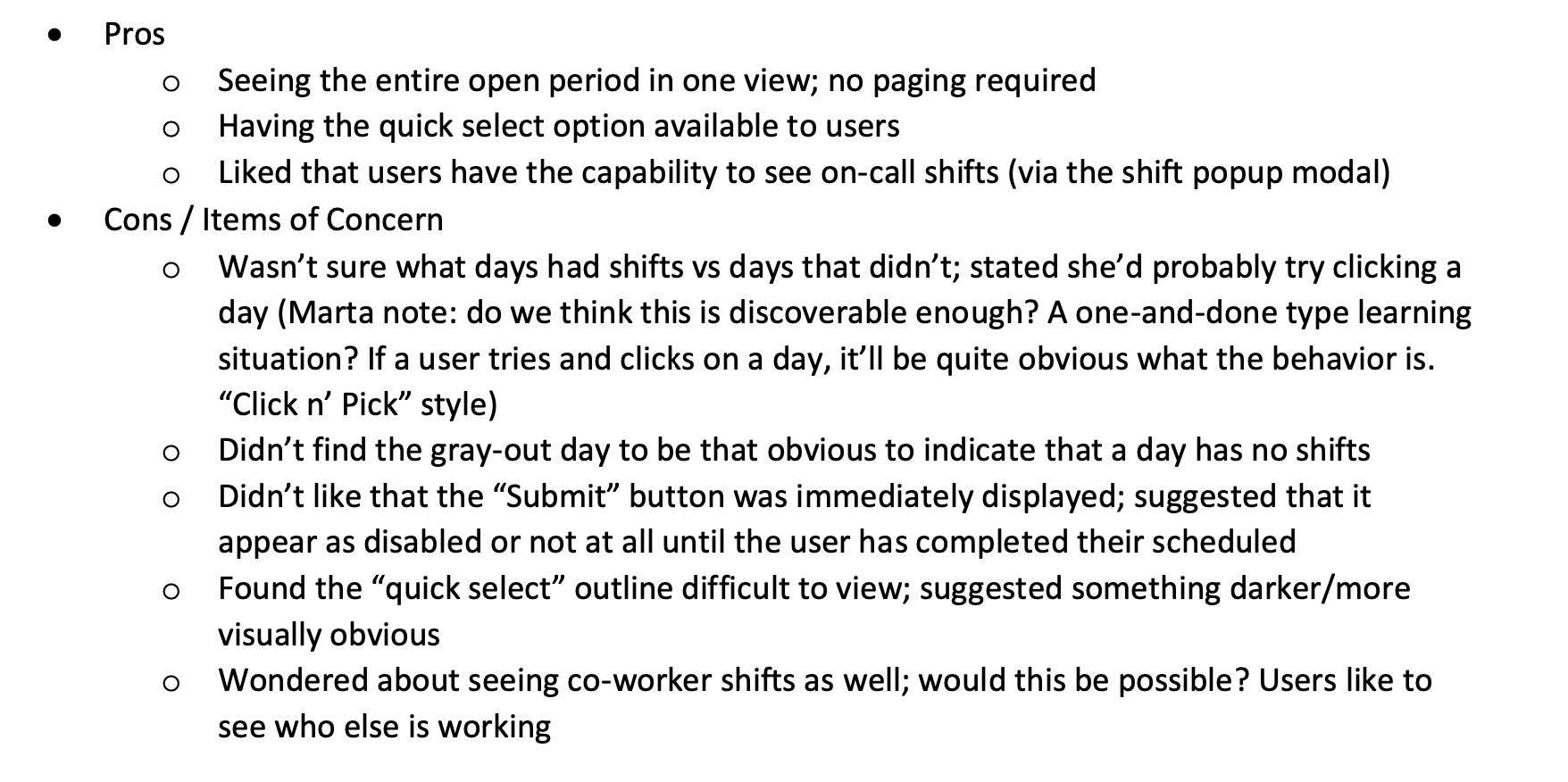
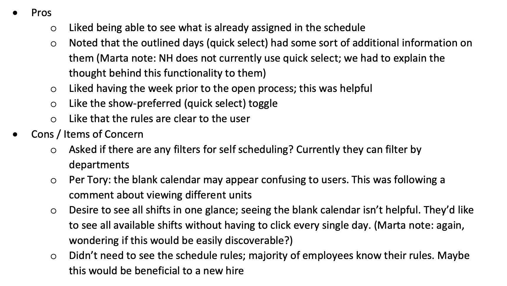
With the core of our designs completed, we tested the critical process of Self Scheduling with end users and customers. This process allows individual employees to self-manage their own schedule, and is a highly sought-after process when it becomes available. We gathered feedback on our designs to ensure the improvements were intuitive for end users to understand, and to identify any gaps.
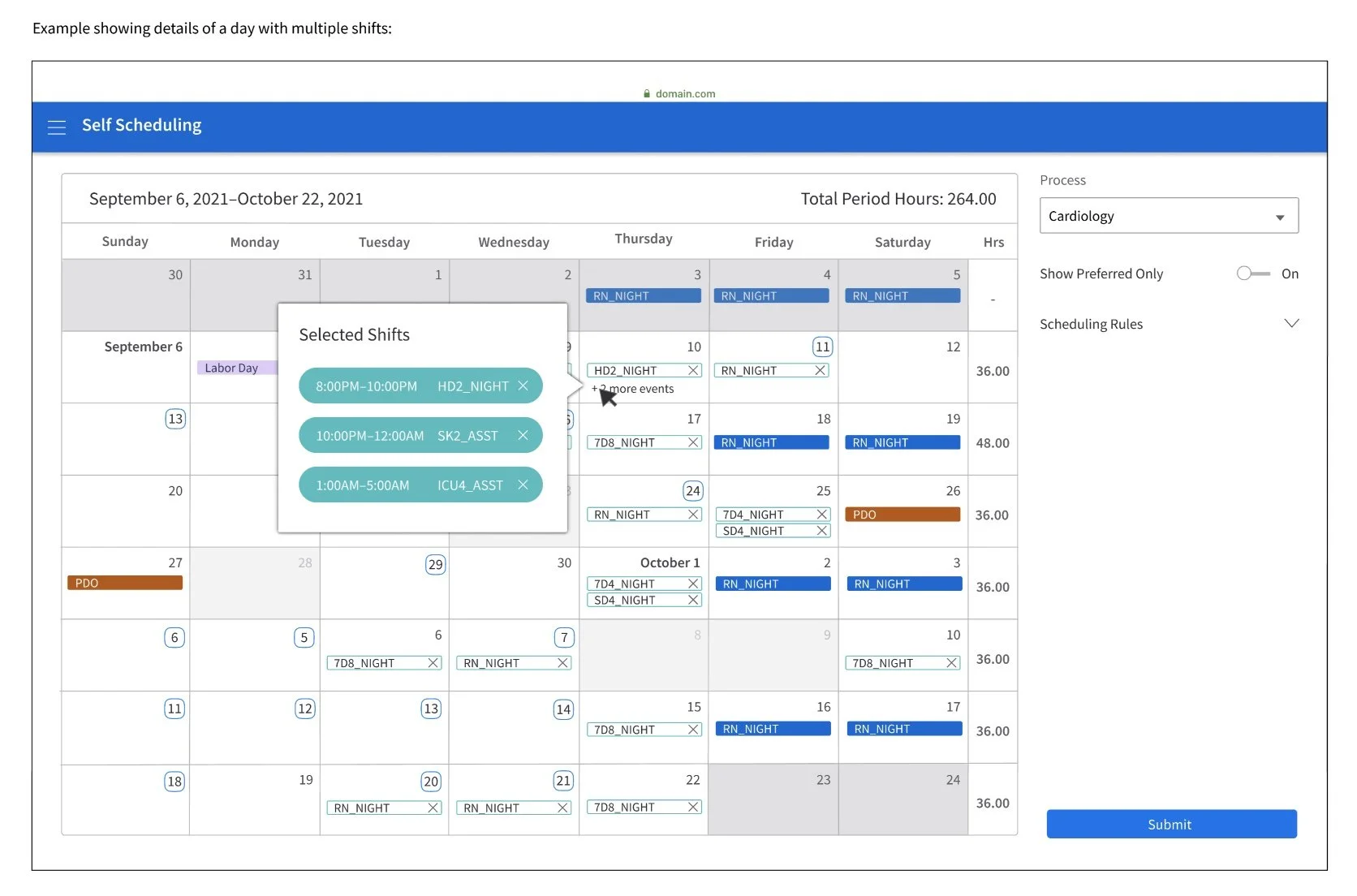
What users said…
Part 6 - Development & Hand Off
After conducting our user and customer feedback sessions and usability tests, I handed the project off to the team of WFM designers to continue work on this project. I compiled all designs with annotations, and prepared a folder with all design assets and other artifacts from my time on the project;
Overview of Final Annotations
In the code:
Part 7 - Post Mortem
The experience of partnering with the WFM team is a highlight of my time at Infor. After being deeply engaged in this project for over a year, I can identify several key items that I learned as a result:
Effective partnering with Product Management & Business Analysts through receiving requirements and conducting regular design reviews
Greater understanding of designing with a design system through partnering with the Infor Design System team
Collaborating with development to understand technical feasibility and how to compromise on solutions